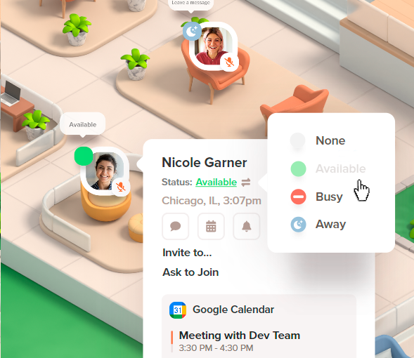
As part of the Welo platform, I was responsible for creating UX/UI materials aimed at improving real-time communication by visually indicating user availability. The goal was to ensure a clear and efficient experience, helping users quickly understand whether an agent or colleague is available, busy, away, or in “Do Not Disturb” mode.
Project Overview:
In this project, I designed a set of status indicators to reflect user availability within the platform. These indicators are essential for effective communication in a dynamic work environment, enabling users to instantly know if they can interact with someone or not.
Status Indicators and Colors:
- Available (Green):
A clear green indicator to show when the user is active and ready to interact. This color was chosen for its universal association with “available” and “ready for action.” - Busy (Red):
The red indicator is used to signal when the user is occupied with another conversation or task. Red, traditionally associated with urgency and attention, helps clearly define when the person should not be interrupted. - Away (Yellow):
Yellow is used to indicate when the user is temporarily away. This color conveys the idea that the person is not available at the moment but may return shortly. - Do Not Disturb (Stronger Red):
A deeper shade of red was chosen for the “Do Not Disturb” status, signaling that the user is unavailable for interactions and prefers not to be disturbed. This indicator is essential to protect focused work periods or critical tasks.
Iconography and Visual Consistency:
One of the biggest challenges in this project was ensuring that the new status indicators aligned seamlessly with the existing iconography and layout of the Welo platform. Since Welo already had an established design and cohesive visual system, it was crucial that the new elements integrated smoothly without compromising the overall visual identity.
- Maintaining Consistency:
To maintain consistency, all status icons were designed to follow the same aesthetic style and proportions as the existing icons used within the platform. This ensured that the new elements didn’t visually clash and created a seamless transition within the interface. - Icon Selection:
I used a simple and intuitive visual language, with representative icons that are easily understood. For example, the “Busy” icon was designed with a minimalist approach, yet distinctive enough to represent the idea of something in progress. Additionally, all icons were optimized to ensure legibility at different screen sizes, maintaining clarity and functionality. - Layout Integration:
The indicators were strategically placed to ensure they were visible without overwhelming the layout. I applied responsive design principles to ensure the status indicators adapted well across different devices, providing a consistent experience on both desktop and mobile.
Outcome and Impact:
The design of the status indicators successfully provided a clear and intuitive way to communicate user availability within the Welo platform. This solution significantly improved real-time communication efficiency and helped users quickly understand the status of their colleagues or agents, leading to more effective interactions.
Integrating the indicators with the existing layout and maintaining visual consistency ensured a smooth and harmonious visual experience, without compromising the platform’s identity.

Deixe um comentário